Manvirender Singh Rawat has more than 17+ years of diverse experience with the ability to produce innovative and exceptional results. He has been in leadership roles where he has successfully delivered multiple projects at national and international levels. Manvirender has joined Cynoteck as Data Science Consultant. He has diverse experience in data analytics, visualization, and advanced analytics. He Read More
We are Microsoft Gold partner with its presence across the United States and India. We are a dynamic and professional IT services provider that serves enterprises and startups, helping them meet the challenges of the global economy. We offer services in the area of CRM Consultation and implementation, Application development, Mobile application development, Web development & Offshore Development.
The 17 most important Data Visualization Techniques for Professionals
Business analytics and data knowledge are increasingly in demand in the workforce. To benefit from data-related skills, you do not need to be a qualified analyst.
You can benefit from data-driven decision-making, including boosted confidence and significant cost savings, by developing your skills in standard data visualization approaches. The first step towards utilizing data analytics and data science to your advantage to benefit your organization could be learning how to effectively visualize data.
17 Data Visualization Techniques
You can improve your effectiveness in your position by using a variety of data visualization strategies. The following list of 17 fundamental data visualization techniques, along with some advice on how to present your data successfully, is for professionals only.
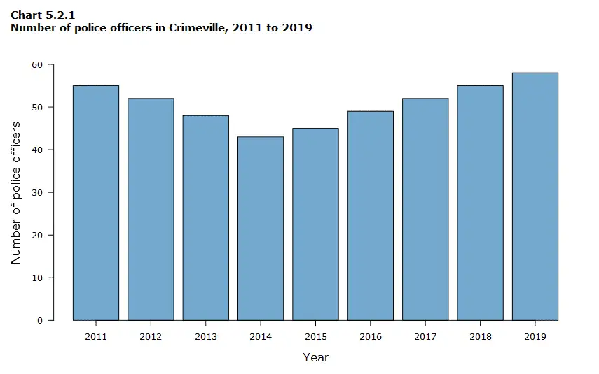
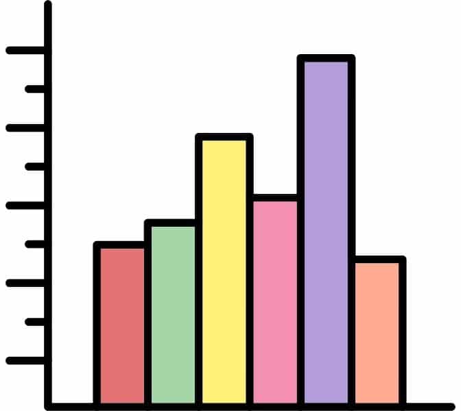
1. Bar Charts
One of the most popular and simple technique for data visualization is the traditional bar chart, sometimes known as the bar graph. In this style of visualization, the categories being compared are shown on one axis of the chart, and a measured value is shown on the other.
The length of the bar shows how well each group is doing compared to the value. But if there are too many groups, it can be hard to label and see clearly.
Similar to pie charts, they may be insufficient for larger, more complex data sets.
A line chart is a basic tool for data visualization that shows trends in data over time or between categories. It makes use of a collection of data points connected by straight lines to show exactly how values change over time. The best way to display trends, variations, and correlations in datasets is with line charts.
They make it simple to spot outliers, cyclical behavior, and upward or downward trends. Using labeled axes and gridlines makes it simple to interpret the data. From banking to scientific research, line charts are widely used to aid professionals in making judgments based on past and present data trends.
Line charts are essential tools for effective insight sharing because they provide a brief summary of data Line charts are essential tools for effective insight sharing because they provide a summary of data changes.
3. Pie Charts
One of the most popular and fundamental data visualization approaches - pie charts. Pie charts are used in many applications. Pie charts are excellent for depicting proportions or comparing parts of an entity to their entire.
Pie charts are best suited for audiences who might not be familiar with the information or who are simply interested in the essential takeaways because they are straightforward to understand. Pie charts cannot adequately display complex information for readers who want a more in-depth explanation of the data.
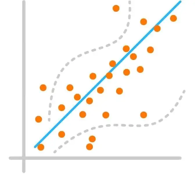
4. Scatter Plots
A scatter plot is yet another method that is frequently used to display data. Using points aligned with the horizontal and vertical axes, a scatter plot shows data for two variables.
The links between variables may be clearly shown with this style of data visualization, which can also be used to spot trends or correlations in the data.
Scatter plots work well with large data sets because it is frequently simpler to spot trends when there are more data points available. Additionally, the connection or trend tends to be larger the closer the data points are gathered.
Histograms, as opposed to bar charts, show how data is distributed over a continuous range or specific period. These visualizations help in locating areas with high concentration of values and any gaps or outlier values.
Histograms are particularly helpful for displaying a specific occurrence's frequency. For instance, you may use a histogram to display the number of clicks your website received each day throughout the previous week.
With the help of this visualization, you can easily identify the days with the most and least clicks on your website.
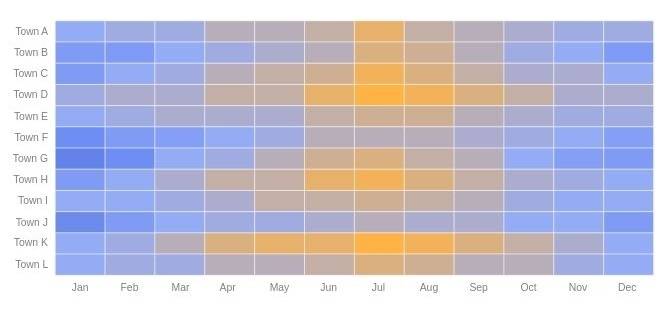
6. Heat maps
A heat map is a sort of visualization that uses color changes to indicate disparities in data. These graphs make it simple for the viewer to rapidly spot trends by using color to communicate values.
For a user to correctly read and interpret a heat map, a clear legend is required. Heat maps have many possible uses.
One example is using a heat map to find out the specific time of day when a retail business makes the most sales.
In this map, the vertical side shows the days of the week, and the horizontal side shows the different times of the day. The areas with higher colors show the times and days when the business makes the most sales.
Then, you may spot patterns in the data that enable you to pinpoint the precise times your store enjoys the highest sales by coloring the matrix with colors that correlate to the volume of sales at each time of day.
7. Box Plots
Through its quartiles, a box plot, box and whisker plot, or box plot offers a visual summary of data. A box is first drawn from the first quartile of the data set to the third. A line inside the box denotes the median.
The box's minimum (lower extreme) and maximum (upper extreme) are then marked with "whiskers," or lines. Individual points that are in line with the whiskers serve as an example of an outlier.
This kind of chart is useful for immediately determining whether the data is symmetrical or skewed and for giving an easily understandable visual summary of the data set.
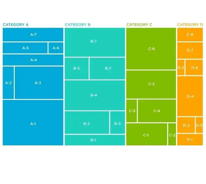
A tree map is an effective method for displaying hierarchical data as nested rectangles. The size of every rectangle indicates a data attribute, and the color might also represent additional information.
Treemaps are useful for demonstrating categories, proportions, and patterns because they can depict complex data structures and hierarchies.
They are frequently used in fields like finance, where they can represent folder sizes in file systems and visualize market sectors and portfolio compositions. Treemaps improve data comprehension and decision-making by helping users quickly understand both the overall picture and specific details.
Furthermore, Treemaps are a crucial component of the data visualization toolset because they can handle massive information and offer insights through shape, scale, and color.
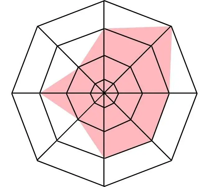
9. Radar Charts
To compare multivariate data with three or more quantitative factors, radar maps are sophisticated graphics. Although they are less frequently used than bar or column graphs, they are quite helpful when analyzing rankings, ratings, or performance.
As an illustration, the employee skill analysis sample presented below displays the evaluation of three employees using a score and six attributes.
This allows users to identify which individual is performing well or poorly in each area and help, as necessary.
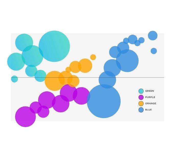
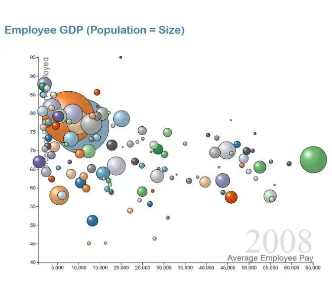
10. Bubble Charts
The dynamic data visualization known as a bubble chart combines three dimensions of data into a single graphic. It uses circles (bubbles) to symbolize the data points, with each bubble's size standing in for a particular numerical value. Two variables are shown on the horizontal and vertical axes, while the bubble size represents a third dimension.
This method enables a quick understanding of intricate interactions between variables. Bubble charts are excellent for exploring multidimensional data because they are good at highlighting patterns, trends, and relationships in datasets.
They are used in a variety of sectors, including scientific research and corporate analytics. To avoid crowding, however, and to guarantee appropriate interpretation, careful design is important.
Bubble charts promote insights that would be overlooked in conventional two-dimensional charts by giving a comprehensive picture of the data.
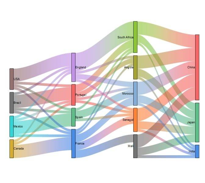
A Sankey diagram is a technique for data visualization that shows how resources, amounts, or values move between different entities. To depict the size of these flows, it uses connected arrows of various widths, which results in a simple yet effective visual representation of complicated systems.
Sankey diagrams, which are frequently used to show energy, material, or cost distributions, shed light on resource allocation, efficiency, and bottlenecks.
Since the width of the arrows is proportional to the quantity being visualized, it is simple to spot dominant flows and waste-producing regions. Through the simplification of complex linkages and the facilitation of the sharing of data-driven insights, these diagrams support decision-making.
Sankey diagrams are useful for understanding and maximizing the complex flow dynamics inside a variety of systems in sectors including engineering, economics, and environmental research.
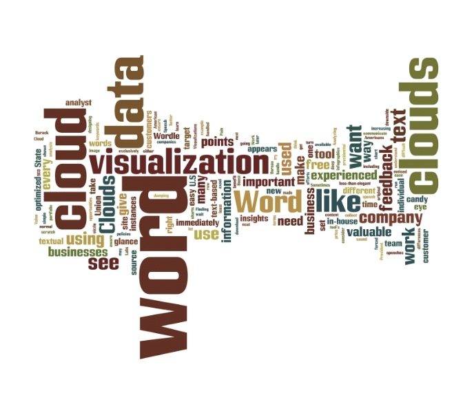
12. Word Cloud
A word cloud, also known as a tag cloud, is a graphic display of text data in which the size of each word corresponds to its frequency.
A word's size increases in visualization in proportion to how frequently it appears in the dataset.
Depending on their frequency, words may also be bolder or use a certain color scheme in addition to changing in size.
Word clouds are commonly employed on websites and blogs to analyze textual differences between two sources and identify significant keywords. Also, they are helpful when examining qualitative datasets, such as the terms customers use to describe a product.
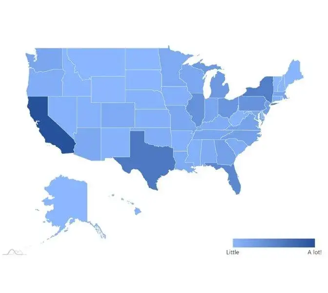
13. Choropleth Maps
A choropleth map represents numerical values across geographical areas by using color, shading, and other patterns. To distinguish between high and low values, these visualizations use the development of color (or shading) on a spectrum.
Viewers may see how a variable change from one region to the next using choropleth maps. The fact that the colors reflect a range of values makes it difficult to get precise numerical values, which could be a drawback to this style of visualization.
However, you may add interactivity to your map using some data visualization tools so that you can get precise values.
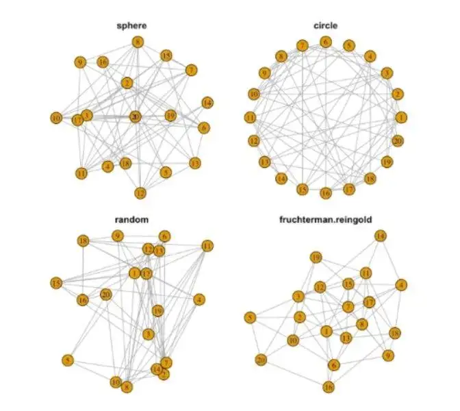
14. Network Graphs
Network graphs help to represent the interconnectedness among the different entities. In this method, the nodes highlight various bodies and edges helping to depict interactions. With the help of this technique, we can easily understand the various network analysis, planning, etc.
One of the major add-ons of these graphs is that they help to show hidden insights. A large database usually makes it difficult to focus on small insights.
Analysts and researchers can better comprehend the underlying structures by visualizing complex networks, which will lead to more well-informed strategies and solutions.
A key component of contemporary data visualization, network graphs allow for the clear and meaningful analysis of interrelated data.
A motion chart is an eye-catching method of displaying data that shows changing patterns and trends over time. Data points are displayed as animated bubbles that move and change in size along axes to reflect changes in various variables.
This method of visual storytelling shows how data changes between dimensions, allowing for the examination of complex datasets.
Users using motion charts are more able to understand temporal variations and relationships than they could be with static visualizations.
Motion charts provide a novel viewpoint on data dynamics and are frequently used for analyzing sizable datasets with time-based variables, such as market movements or demographic transitions.
They promote data-driven narratives and enable deeper insights by engagingly and interactively exhibiting data evolution, improving decision-making and comprehension of complex data patterns.
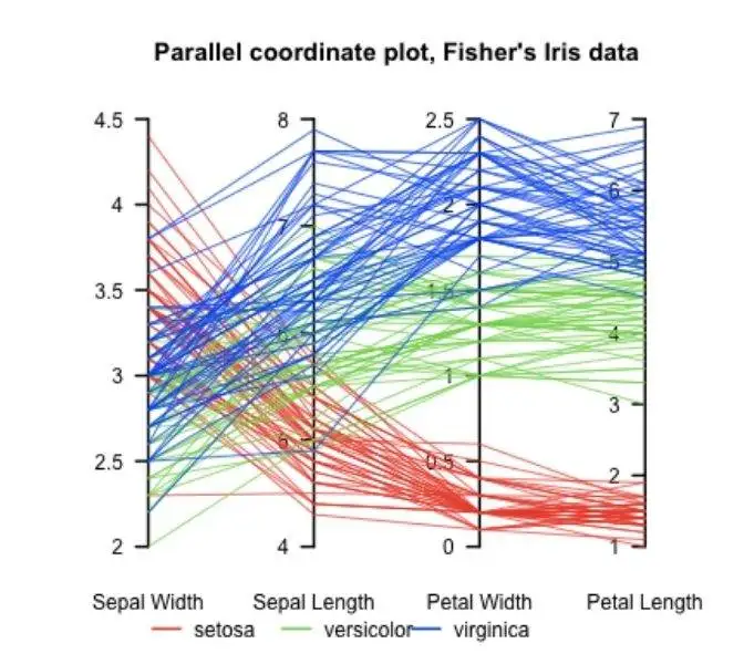
16. Parallel Coordinates
When displaying multivariate data, parallel coordinates are a potent data visualization tool. To show how variables interact, it is necessary to draw several parallel lines, each of which represents a different data point.
When applied to datasets, this technique reveals intricate correlations and patterns that conventional charts may have missed.
Parallel coordinates allow consumers to see numerous dimensions at once and patterns, clusters, and outliers in the data.
This method is extremely helpful for exploring high-dimensional datasets, such as those used in machine learning, finance, and scientific research. Despite being useful, interpretation can be difficult, especially when there are many factors involved.
Parallel coordinates are invaluable for data exploration and insight extraction since careful axis scaling and labeling are essential for accurate analysis.
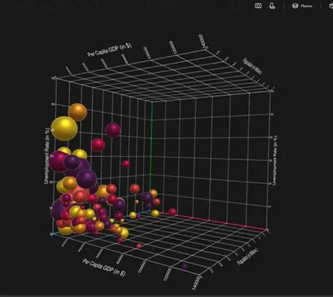
17. 3D Visualizations
To improve depth perception and offer a more complete grasp of complex material, 3D data visualization involves presenting data in three dimensions. Viewers can investigate data from a variety of perspectives with the help of the additional layer of visual context it adds.
While 3D visualizations can provide insightful information, they also run the danger of distorting data and leading to false conclusions because of occlusion and perspective problems.
The data and message being delivered must be carefully considered when using 3D approaches. It has uses in the design, geospatial analysis, and medical imaging industries.
Despite its downsides, 3D data visualization can, when used properly, offer a richer viewpoint that helps expose hidden patterns and relationships within the data.
Data visualizations enable users and businesses to make enormous volumes of pertinent data more accessible and clearer, as can be shown throughout this book. Market competition is increasing daily, making it necessary rather than optional for businesses to utilize the potential of data analytics. Businesses that recognize this will have a significant competitive advantage.
We hope that these ideas for data visualization will help to advance your work and make it more fruitful. Explore our innovative business intelligence and online data visualization tools to improve your current activities today.
Frequently Asked Questions:
Q. What is the purpose of data visualization techniques?
Data visualization techniques transform complex data into visual representations, making it easier to understand patterns, trends, and insights, helping in better decision-making.
Q. How do Heatmaps work as a data visualization method?
Heatmaps use color variations to highlight data intensity on a matrix, helping to highlight relationships, correlations, and areas of focus within large datasets.
Q. What are the advantages of using bar charts for data representation?
Bar charts offer a clear comparison of data categories, making them suitable for visualizing discrete values and identifying trends across different groups.
Q. Can you explain the significance of choropleth maps?
Choropleth maps use color gradients to display data values across geographic regions, allowing easy identification of spatial patterns and variations in data distribution.
Q. How do bubble charts add value to data visualization?
Bubble charts represent three dimensions of data through circle size and position on a two-dimensional plane, effectively conveying relationships and trends in a single visualization.
Business analytics and data knowledge are increasingly in demand in the workforce. To benefit from data-related skills, you do not need to be a qualified analyst.
You can benefit from data-driven decision-making, including boosted confidence and significant cost savings, by developing your skills in standard data visualization approaches. The first step towards utilizing data analytics and data science to your advantage to benefit your organization could be learning how to effectively visualize data.
You can improve your effectiveness in your position by using a variety of data visualization strategies. The following list of 17 fundamental data visualization techniques, along with some advice on how to present your data successfully, is for professionals only.
1. Bar Charts
One of the most popular and simple technique for data visualization is the traditional bar chart, sometimes known as the bar graph. In this style of visualization, the categories being compared are shown on one axis of the chart, and a measured value is shown on the other.
The length of the bar shows how well each group is doing compared to the value. But if there are too many groups, it can be hard to label and see clearly.
Similar to pie charts, they may be insufficient for larger, more complex data sets.
A line chart is a basic tool for data visualization that shows trends in data over time or between categories. It makes use of a collection of data points connected by straight lines to show exactly how values change over time. The best way to display trends, variations, and correlations in datasets is with line charts.
They make it simple to spot outliers, cyclical behavior, and upward or downward trends. Using labeled axes and gridlines makes it simple to interpret the data. From banking to scientific research, line charts are widely used to aid professionals in making judgments based on past and present data trends.
Line charts are essential tools for effective insight sharing because they provide a brief summary of data Line charts are essential tools for effective insight sharing because they provide a summary of data changes.
3. Pie Charts
One of the most popular and fundamental data visualization approaches – pie charts. Pie charts are used in many applications. Pie charts are excellent for depicting proportions or comparing parts of an entity to their entire.
Pie charts are best suited for audiences who might not be familiar with the information or who are simply interested in the essential takeaways because they are straightforward to understand. Pie charts cannot adequately display complex information for readers who want a more in-depth explanation of the data.
4. Scatter Plots
A scatter plot is yet another method that is frequently used to display data. Using points aligned with the horizontal and vertical axes, a scatter plot shows data for two variables.
The links between variables may be clearly shown with this style of data visualization, which can also be used to spot trends or correlations in the data.
Scatter plots work well with large data sets because it is frequently simpler to spot trends when there are more data points available. Additionally, the connection or trend tends to be larger the closer the data points are gathered.
Histograms, as opposed to bar charts, show how data is distributed over a continuous range or specific period. These visualizations help in locating areas with high concentration of values and any gaps or outlier values.
Histograms are particularly helpful for displaying a specific occurrence’s frequency. For instance, you may use a histogram to display the number of clicks your website received each day throughout the previous week.
With the help of this visualization, you can easily identify the days with the most and least clicks on your website.
6. Heat maps
A heat map is a sort of visualization that uses color changes to indicate disparities in data. These graphs make it simple for the viewer to rapidly spot trends by using color to communicate values.
For a user to correctly read and interpret a heat map, a clear legend is required. Heat maps have many possible uses.
One example is using a heat map to find out the specific time of day when a retail business makes the most sales.
In this map, the vertical side shows the days of the week, and the horizontal side shows the different times of the day. The areas with higher colors show the times and days when the business makes the most sales.
Then, you may spot patterns in the data that enable you to pinpoint the precise times your store enjoys the highest sales by coloring the matrix with colors that correlate to the volume of sales at each time of day.
7. Box Plots
Through its quartiles, a box plot, box and whisker plot, or box plot offers a visual summary of data. A box is first drawn from the first quartile of the data set to the third. A line inside the box denotes the median.
The box’s minimum (lower extreme) and maximum (upper extreme) are then marked with “whiskers,” or lines. Individual points that are in line with the whiskers serve as an example of an outlier.
This kind of chart is useful for immediately determining whether the data is symmetrical or skewed and for giving an easily understandable visual summary of the data set.
A tree map is an effective method for displaying hierarchical data as nested rectangles. The size of every rectangle indicates a data attribute, and the color might also represent additional information.
Treemaps are useful for demonstrating categories, proportions, and patterns because they can depict complex data structures and hierarchies.
They are frequently used in fields like finance, where they can represent folder sizes in file systems and visualize market sectors and portfolio compositions. Treemaps improve data comprehension and decision-making by helping users quickly understand both the overall picture and specific details.
Furthermore, Treemaps are a crucial component of the data visualization toolset because they can handle massive information and offer insights through shape, scale, and color.
9. Radar Charts
To compare multivariate data with three or more quantitative factors, radar maps are sophisticated graphics. Although they are less frequently used than bar or column graphs, they are quite helpful when analyzing rankings, ratings, or performance.
As an illustration, the employee skill analysis sample presented below displays the evaluation of three employees using a score and six attributes.
This allows users to identify which individual is performing well or poorly in each area and help, as necessary.
10. Bubble Charts
The dynamic data visualization known as a bubble chart combines three dimensions of data into a single graphic. It uses circles (bubbles) to symbolize the data points, with each bubble’s size standing in for a particular numerical value. Two variables are shown on the horizontal and vertical axes, while the bubble size represents a third dimension.
This method enables a quick understanding of intricate interactions between variables. Bubble charts are excellent for exploring multidimensional data because they are good at highlighting patterns, trends, and relationships in datasets.
They are used in a variety of sectors, including scientific research and corporate analytics. To avoid crowding, however, and to guarantee appropriate interpretation, careful design is important.
Bubble charts promote insights that would be overlooked in conventional two-dimensional charts by giving a comprehensive picture of the data.
A Sankey diagram is a technique for data visualization that shows how resources, amounts, or values move between different entities. To depict the size of these flows, it uses connected arrows of various widths, which results in a simple yet effective visual representation of complicated systems.
Sankey diagrams, which are frequently used to show energy, material, or cost distributions, shed light on resource allocation, efficiency, and bottlenecks.
Since the width of the arrows is proportional to the quantity being visualized, it is simple to spot dominant flows and waste-producing regions. Through the simplification of complex linkages and the facilitation of the sharing of data-driven insights, these diagrams support decision-making.
Sankey diagrams are useful for understanding and maximizing the complex flow dynamics inside a variety of systems in sectors including engineering, economics, and environmental research.
12. Word Cloud
A word cloud, also known as a tag cloud, is a graphic display of text data in which the size of each word corresponds to its frequency.
A word’s size increases in visualization in proportion to how frequently it appears in the dataset.
Depending on their frequency, words may also be bolder or use a certain color scheme in addition to changing in size.
Word clouds are commonly employed on websites and blogs to analyze textual differences between two sources and identify significant keywords. Also, they are helpful when examining qualitative datasets, such as the terms customers use to describe a product.
13. Choropleth Maps
A choropleth map represents numerical values across geographical areas by using color, shading, and other patterns. To distinguish between high and low values, these visualizations use the development of color (or shading) on a spectrum.
Viewers may see how a variable change from one region to the next using choropleth maps. The fact that the colors reflect a range of values makes it difficult to get precise numerical values, which could be a drawback to this style of visualization.
However, you may add interactivity to your map using some data visualization tools so that you can get precise values.
14. Network Graphs
Network graphs help to represent the interconnectedness among the different entities. In this method, the nodes highlight various bodies and edges helping to depict interactions. With the help of this technique, we can easily understand the various network analysis, planning, etc.
One of the major add-ons of these graphs is that they help to show hidden insights. A large database usually makes it difficult to focus on small insights.
Analysts and researchers can better comprehend the underlying structures by visualizing complex networks, which will lead to more well-informed strategies and solutions.
A key component of contemporary data visualization, network graphs allow for the clear and meaningful analysis of interrelated data.
A motion chart is an eye-catching method of displaying data that shows changing patterns and trends over time. Data points are displayed as animated bubbles that move and change in size along axes to reflect changes in various variables.
This method of visual storytelling shows how data changes between dimensions, allowing for the examination of complex datasets.
Users using motion charts are more able to understand temporal variations and relationships than they could be with static visualizations.
Motion charts provide a novel viewpoint on data dynamics and are frequently used for analyzing sizable datasets with time-based variables, such as market movements or demographic transitions.
They promote data-driven narratives and enable deeper insights by engagingly and interactively exhibiting data evolution, improving decision-making and comprehension of complex data patterns.
16. Parallel Coordinates
When displaying multivariate data, parallel coordinates are a potent data visualization tool. To show how variables interact, it is necessary to draw several parallel lines, each of which represents a different data point.
When applied to datasets, this technique reveals intricate correlations and patterns that conventional charts may have missed.
Parallel coordinates allow consumers to see numerous dimensions at once and patterns, clusters, and outliers in the data.
This method is extremely helpful for exploring high-dimensional datasets, such as those used in machine learning, finance, and scientific research. Despite being useful, interpretation can be difficult, especially when there are many factors involved.
Parallel coordinates are invaluable for data exploration and insight extraction since careful axis scaling and labeling are essential for accurate analysis.
17. 3D Visualizations
To improve depth perception and offer a more complete grasp of complex material, 3D data visualization involves presenting data in three dimensions. Viewers can investigate data from a variety of perspectives with the help of the additional layer of visual context it adds.
While 3D visualizations can provide insightful information, they also run the danger of distorting data and leading to false conclusions because of occlusion and perspective problems.
The data and message being delivered must be carefully considered when using 3D approaches. It has uses in the design, geospatial analysis, and medical imaging industries.
Despite its downsides, 3D data visualization can, when used properly, offer a richer viewpoint that helps expose hidden patterns and relationships within the data.
Data visualizations enable users and businesses to make enormous volumes of pertinent data more accessible and clearer, as can be shown throughout this book. Market competition is increasing daily, making it necessary rather than optional for businesses to utilize the potential of data analytics. Businesses that recognize this will have a significant competitive advantage.
We hope that these ideas for data visualization will help to advance your work and make it more fruitful. Explore our innovative business intelligence and online data visualization tools to improve your current activities today.
Frequently Asked Questions:
Q. What is the purpose of data visualization techniques?
Data visualization techniques transform complex data into visual representations, making it easier to understand patterns, trends, and insights, helping in better decision-making.
Q. How do Heatmaps work as a data visualization method?
Heatmaps use color variations to highlight data intensity on a matrix, helping to highlight relationships, correlations, and areas of focus within large datasets.
Q. What are the advantages of using bar charts for data representation?
Bar charts offer a clear comparison of data categories, making them suitable for visualizing discrete values and identifying trends across different groups.
Q. Can you explain the significance of choropleth maps?
Choropleth maps use color gradients to display data values across geographic regions, allowing easy identification of spatial patterns and variations in data distribution.
Q. How do bubble charts add value to data visualization?
Bubble charts represent three dimensions of data through circle size and position on a two-dimensional plane, effectively conveying relationships and trends in a single visualization.
Harness the power of Data Science
Unlock hidden opportunities, optimize processes, and make smarter decisions. Contact us today to discover how our Data Science services can propel your organization forward. Don't let your data go untapped. Take action now and revolutionize your business with Data Science.