Pooja Sharma is a technology enthusiast and an experienced developer serving as a Competency Head - OpenSource at Cynoteck. With a strong background in Open-Source Web Development Platforms, she specializes in delivering a wide array of projects, including CMS systems, E-commerce websites, API integrations, Dynamics websites, and PHP framework-based sites. Over the past 6+ years, Read More
We are Microsoft Gold partner with its presence across the United States and India. We are a dynamic and professional IT services provider that serves enterprises and startups, helping them meet the challenges of the global economy. We offer services in the area of CRM Consultation and implementation, Application development, Mobile application development, Web development & Offshore Development.
CSS Grid and Flexbox are two very powerful CSS Layout tools. In this article we will compare them and see which one to choose and when to choose.
When Flexbox come out a lot of designers were so excited because it changed the way we were doing layouts and then came Grid, both opened up the opportunities for making interesting compelling layouts. Both Flexbox and Grid are based on the concept of rows and columns. The only problem that was and continues to be is both layout options can get complicated very quickly and many aren’t sure about when to use flexbox and when to use grid. In this blog, we’ll understand the basics of both layouts and how to choose between both layouts. Let’s deep dive into this one by one.
What is CSS GRID?
The CSS Grid Layout is also a content-first layout that allows you to layout items flexibly that not just allows you to layout it in one-dimensional but in two-dimensions grid-based. CSS Grid is one of the most influential and powerful layout tools. It allows you to create a dynamic, responsive, and complex layout and organized layout with little code.
CSS GRID is a grid system which is flexible and adaptable to many screen sizes. It can be used for both responsive layouts and non-responsive layouts.
Instead of being hard coded, it follows a set of guidelines which allow the designer to decide on what elements are responsive to breakpoints, how they are positioned on the grid, and so much more.
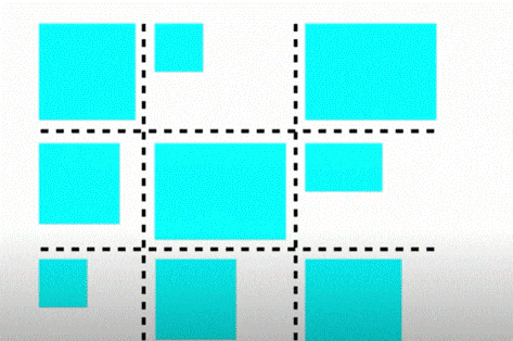
GRID LAYOUT
CSS GRID Vs FLEXBOX
So, here is a diagram of a grid layout where the things are lining up in both directions.
A FLEXBOX is a container that can display content on any device, irrespective of the screen size.
FLEXBOX can be used to create responsive layouts for your website that will work across all devices.
FLEXBOX also known as flexible box model is a CSS3 one-dimensional layout mode that provides an easy and clean way to arrange items within a container so if you use CSS for a while you’ve probably been using the old block model wherein you assign widths whether it’s a percentage or a fixed width and then you use floats to arrange items on a page, for example - if you want three boxes in a row and then you’d have to provide your margins and to achieve the desired result, so flexbox has taken care of all that stuff and there are features such as:-
No Floats.
Responsive and mobile-friendly.
Positioning child elements is much easier.
Flex container’s margins do not tumble with the margins of its contents.
The order of elements can smoothly be adjusted without editing the source HTML.
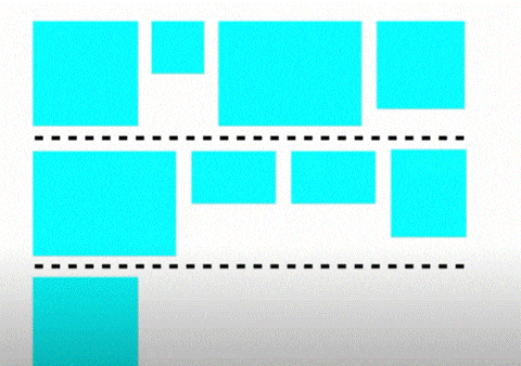
FLEXBOX LAYOUT
CSS GRID Vs FLEXBOX
And here is a diagram about how things might work out in flexbox where the calculations are being done in each row one at a time with no regard to the other rows.
So, from here we come to know the main difference between one and two dimensions is that a Flexbox can work on either rows or columns at a time whereas Grid being two dimensional can work on both at a time.
Another significant difference is that Grid takes a basis in the layout while Flexbox takes a basis in the content. This will become clearer with the following example: -
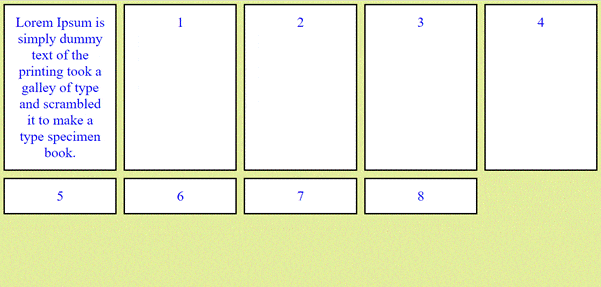
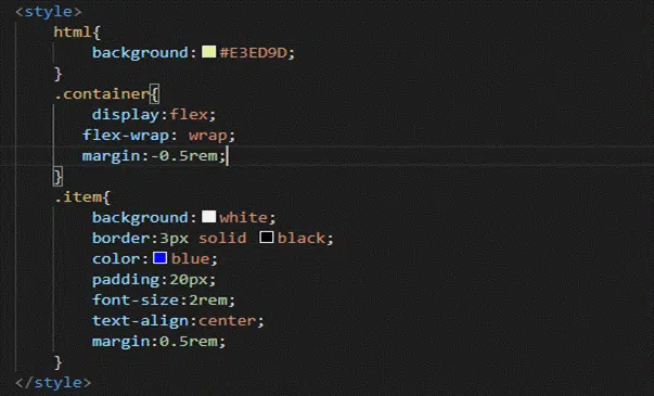
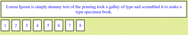
let’s consider a container having nine items where the very first item is having some text in it.
Common html Code
GRID style
GRID Vs FLEXBOX
Here in the Grid Layout the content inside the box doesn’t stretch.
GRID Vs FLEXBOX
FLEXBOX style
GRID Vs FLEXBOX
Whereas, here in the FLEX Layout the content inside the box stretches.
Now after understanding the basics of both the layout let's jump to the major objective of the blog as this is the part where most of the developers get stuck.
Grid vs Flexbox
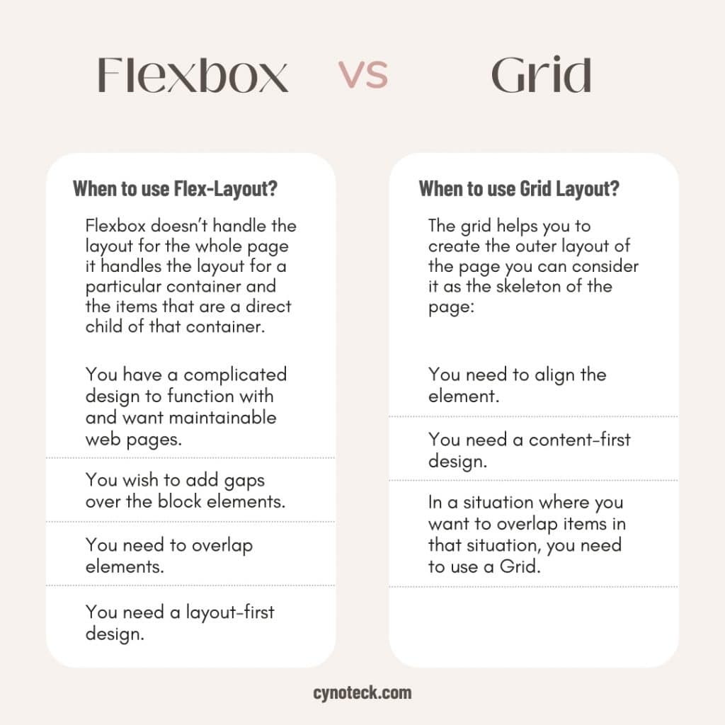
When to use Flex-Layout?
One of the main reasons to use Flex-Layout is for creating responsive layouts.
When should I use it? One of the main reasons to use Flex-Layout is for creating responsive layouts.
Flexbox doesn’t handle the layout for the whole page it handles the layout for a particular container and the items that are a direct child of that container.
You have a complicated design to function with and want maintainable web pages.
You wish to add gaps over the block elements.
You need to overlap elements.
You need a layout-first design.
When to use Grid Layout?
A grid layout is a web page design that lays out content in a grid of columns, where each column can have any arbitrary width.
The grid layout is one of the most common types of web design layouts today. It is widely used because it offers two main benefits: it simplifies the process of dividing space into columns and rows, and it ensures that all elements are aligned to a baseline grid.
This type of layout has been around for many years already, but only now it has really started to gain popularity due to its flexibility. Many designers are now using this type of layout as their starting point when designing any website or app interface.
The grid helps you to create the outer layout of the page you can consider it as the skeleton of the page:
You need to align the element.
You need a content-first design.
The Grid can do one thing that Flexbox cannot do, which is, it can intentionally overlap items. So, in a situation where you want to overlap items in that situation, you need to use a Grid.
Here’s an example where we got the content images and there is a sentence for each one with a little background.
So, we can use Grid for this, we could use Flexbox if there was no overlap involved but because there is overlap so you need to use Grid.
CSS Grid and Flexbox are two very powerful CSS Layout tools. In this article we will compare them and see which one to choose and when to choose.
When Flexbox come out a lot of designers were so excited because it changed the way we were doing layouts and then came Grid, both opened up the opportunities for making interesting compelling layouts. Both Flexbox and Grid are based on the concept of rows and columns. The only problem that was and continues to be is both layout options can get complicated very quickly and many aren’t sure about when to use flexbox and when to use grid. In this blog, we’ll understand the basics of both layouts and how to choose between both layouts. Let’s deep dive into this one by one.
The CSS Grid Layout is also a content-first layout that allows you to layout items flexibly that not just allows you to layout it in one-dimensional but in two-dimensions grid-based. CSS Grid is one of the most influential and powerful layout tools. It allows you to create a dynamic, responsive, and complex layout and organized layout with little code.
CSS GRID is a grid system which is flexible and adaptable to many screen sizes. It can be used for both responsive layouts and non-responsive layouts.
Instead of being hard coded, it follows a set of guidelines which allow the designer to decide on what elements are responsive to breakpoints, how they are positioned on the grid, and so much more.
GRID LAYOUT
CSS GRID Vs FLEXBOX
So, here is a diagram of a grid layout where the things are lining up in both directions.
A FLEXBOX is a container that can display content on any device, irrespective of the screen size.
FLEXBOX can be used to create responsive layouts for your website that will work across all devices.
FLEXBOX also known as flexible box model is a CSS3 one-dimensional layout mode that provides an easy and clean way to arrange items within a container so if you use CSS for a while you’ve probably been using the old block model wherein you assign widths whether it’s a percentage or a fixed width and then you use floats to arrange items on a page, for example – if you want three boxes in a row and then you’d have to provide your margins and to achieve the desired result, so flexbox has taken care of all that stuff and there are features such as:-
No Floats.
Responsive and mobile-friendly.
Positioning child elements is much easier.
Flex container’s margins do not tumble with the margins of its contents.
The order of elements can smoothly be adjusted without editing the source HTML.
FLEXBOX LAYOUT
CSS GRID Vs FLEXBOX
And here is a diagram about how things might work out in flexbox where the calculations are being done in each row one at a time with no regard to the other rows.
So, from here we come to know the main difference between one and two dimensions is that a Flexbox can work on either rows or columns at a time whereas Grid being two dimensional can work on both at a time.
Another significant difference is that Grid takes a basis in the layout while Flexbox takes a basis in the content. This will become clearer with the following example: –
let’s consider a container having nine items where the very first item is having some text in it.
Common html Code
GRID style
GRID Vs FLEXBOX
Here in the Grid Layout the content inside the box doesn’t stretch.
GRID Vs FLEXBOX
FLEXBOX style
GRID Vs FLEXBOX
Whereas, here in the FLEX Layout the content inside the box stretches.
Now after understanding the basics of both the layout let’s jump to the major objective of the blog as this is the part where most of the developers get stuck.
Grid vs Flexbox
When to use Flex-Layout?
One of the main reasons to use Flex-Layout is for creating responsive layouts.
When should I use it? One of the main reasons to use Flex-Layout is for creating responsive layouts.
Flexbox doesn’t handle the layout for the whole page it handles the layout for a particular container and the items that are a direct child of that container.
You have a complicated design to function with and want maintainable web pages.
You wish to add gaps over the block elements.
You need to overlap elements.
You need a layout-first design.
When to use Grid Layout?
A grid layout is a web page design that lays out content in a grid of columns, where each column can have any arbitrary width.
The grid layout is one of the most common types of web design layouts today. It is widely used because it offers two main benefits: it simplifies the process of dividing space into columns and rows, and it ensures that all elements are aligned to a baseline grid.
This type of layout has been around for many years already, but only now it has really started to gain popularity due to its flexibility. Many designers are now using this type of layout as their starting point when designing any website or app interface.
The grid helps you to create the outer layout of the page you can consider it as the skeleton of the page:
You need to align the element.
You need a content-first design.
The Grid can do one thing that Flexbox cannot do, which is, it can intentionally overlap items. So, in a situation where you want to overlap items in that situation, you need to use a Grid.
Here’s an example where we got the content images and there is a sentence for each one with a little background.
So, we can use Grid for this, we could use Flexbox if there was no overlap involved but because there is overlap so you need to use Grid.
Are you looking for a reliable web development company? Our highly skilled web developers enables us to deliver result oriented web development services. Contact our team to understand, how we can help you in achieving your business goals.
 +1 (415) 429-6641 |