We are Microsoft Gold partner with its presence across the United States and India. We are a dynamic and professional IT services provider that serves enterprises and startups, helping them meet the challenges of the global economy. We offer services in the area of CRM Consultation and implementation, Application development, Mobile application development, Web development & Offshore Development.
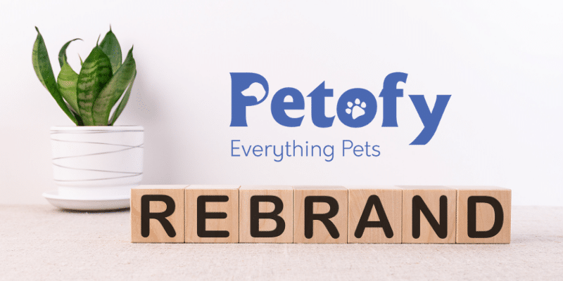
Petofy is an aggregator platform for everything your pet needs. It connects pet owners with pet service providers helping them find all services in one digital platform.
Why rebranding
Want to reposition and communicate our core values crystal clear like who we are and what values do we provide.
About
This blog is the overview of our disciplined process that we have followed before reaching the final solution and our learnings throughout the journey.
Understanding brand
To understand the brand better we’ve requested the Baseline information from stakeholders by asking some core questions mentioned below:
What does your business do?
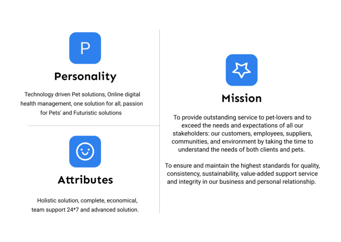
What is your mission?
Who is the target customer?
What is the brand’s personality?
What are your Brand Attributes?
What words would you use to describe your brand?
Who are the top three competitors?
Answers to these questions have helped us understand their brand better.
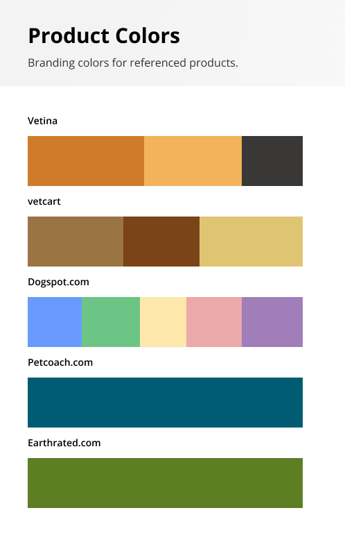
Competitive Audit
To understand the competition’s brands, their key messages, and identity in the marketplace were analyzed to understand their conversation rate and how we can be different from them in terms of visual identity (Symbols, Forms, Color, Typography).
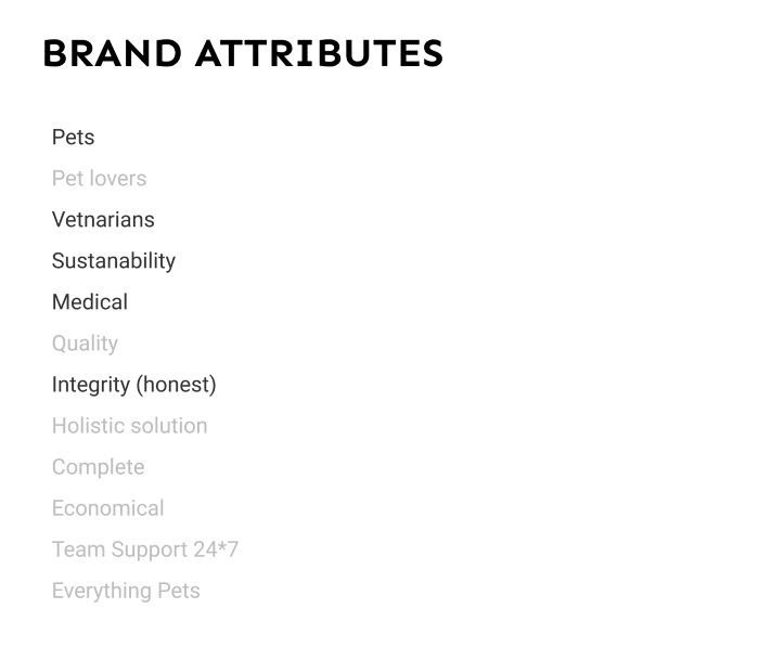
Finding the right attributes
Attributes were segregated and major ones were highlighted from the questions that were asked before.
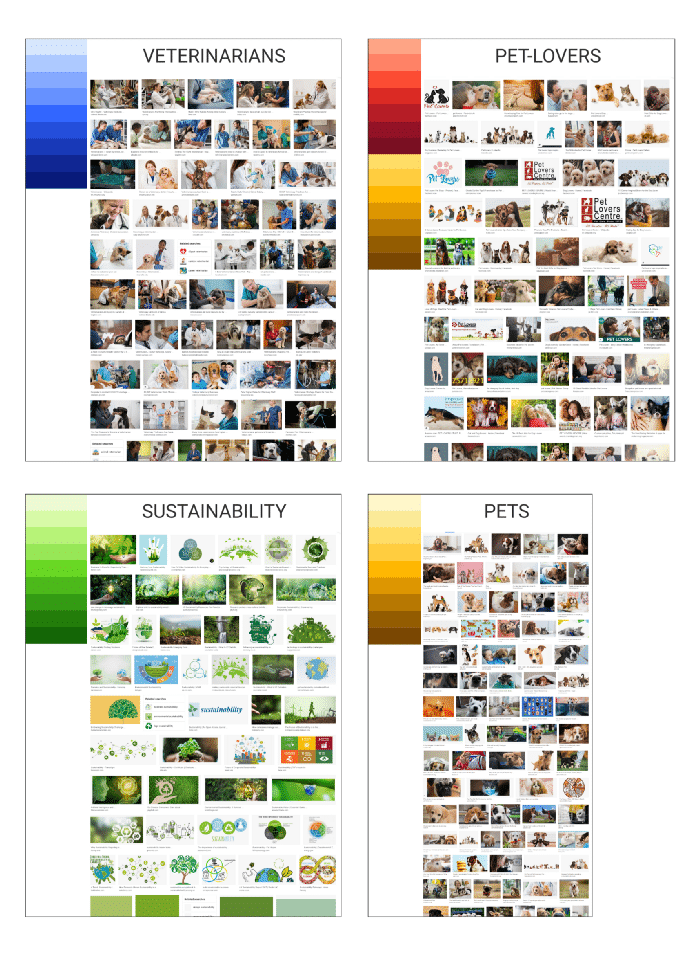
Attributes VS Visuals
To understand the visual grammar of each highlighted attribute, visuals were collected to understand the majority of colors used in each image and to understand what emotional values are they conveying.
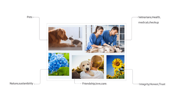
Moodboard
Since there were too many visuals at the same time previously, so the final 5–6 visuals were selected to use in the mood board to understand the kind of emotions and message one will get in the first 5-seconds view.
Thoughts behind each visual
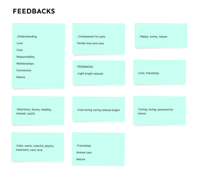
Feedbacks on mood board
Moodboard were circulated among veterinarians, pet parents, Teenagers and were asked to comment on some of the keywords that come to their mind when they first see this so that we can validate my thought process and understand how effective each visual can be by color or the content that it has.
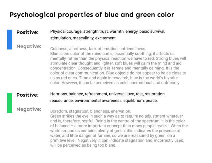
Understanding primary color
Based on previous answers and research the color blue and green were taking a call towards the brand's primary color. But to create a hierarchy on site that “coaches” customers on which color encourages action we tried to study the color psychological properties of the color green and blue.
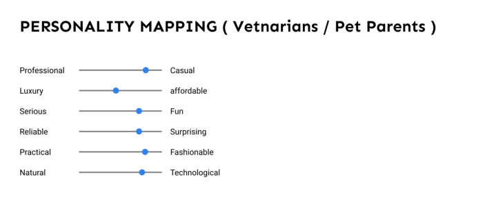
Personality Mapping
We have not deep dive into this step but did a basic overview based on comparing basic terms like professional vs casual and more with different colors. To understand which color can create more value in terms of actions and emotions.
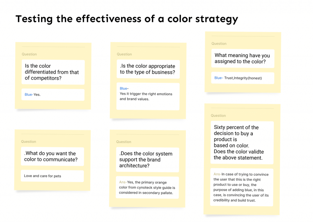
Color Strategy
Since the color blue was standing out more in all the past steps that we have taken, so we tried to validate our design decision by answering the following questions mentioned below.
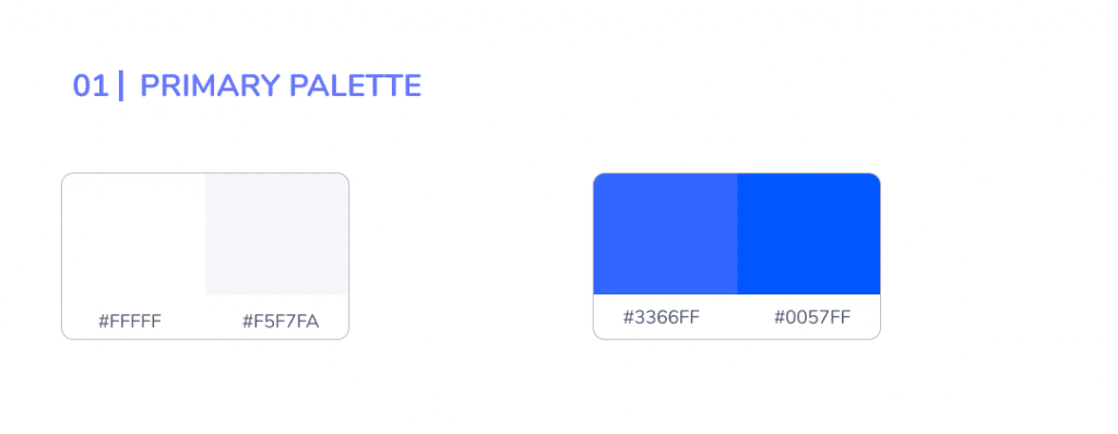
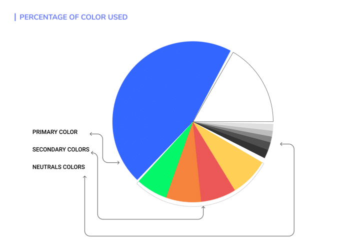
The primary palette is comprised of neutrals, white, and blue was considered to build trust and increase the conversation rate with the product.
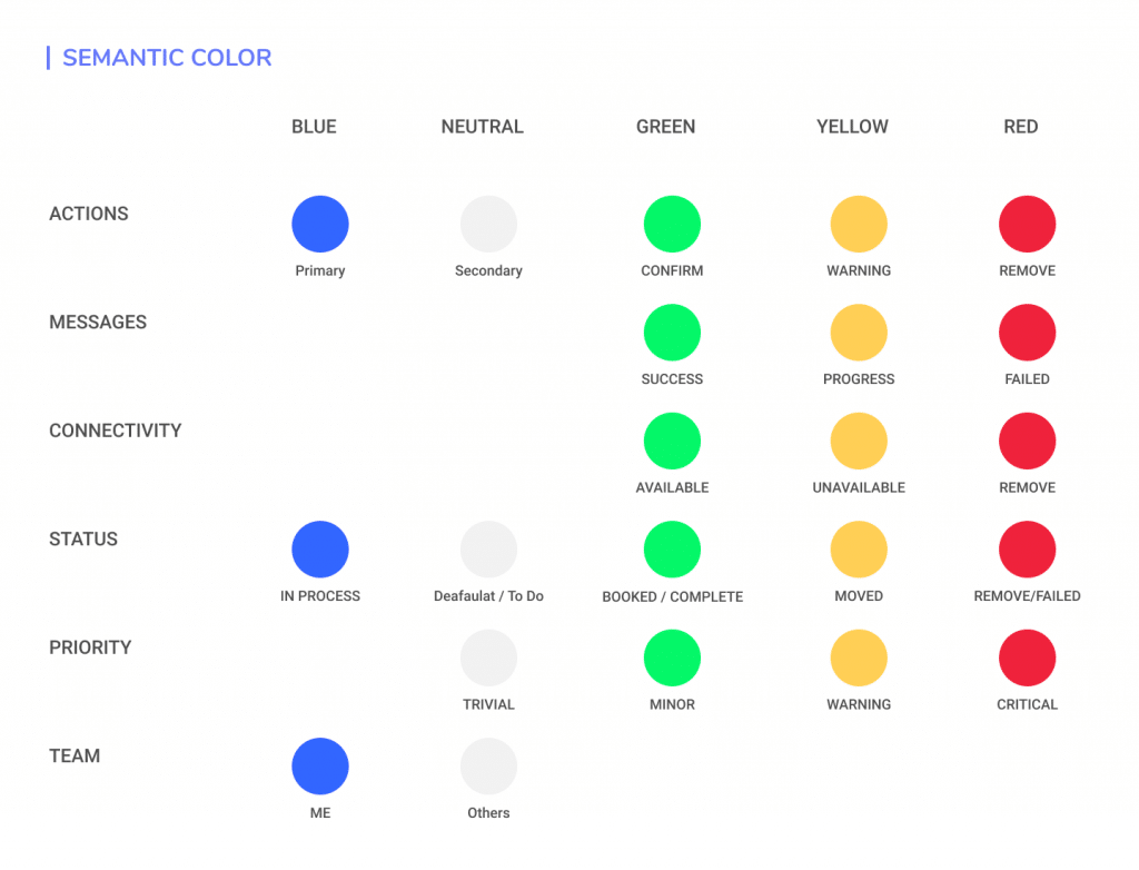
Blue is considered for primary actions, buttons, text links, for indicating progress and representing authentication. A neutral white will be used primarily for body text and headings, and pure white (#FFfFF) WILL BE used for page backgrounds.
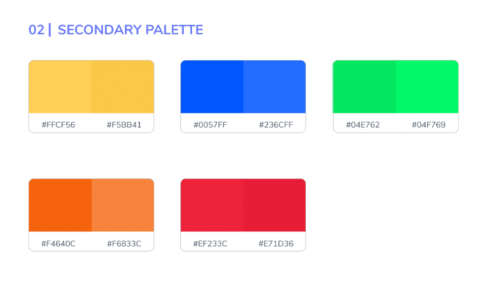
The secondary palette is made up of red, yellow, orange, green, etc to provide consistency and to use in illustrations to convey brand values. Each color is selected intentionally with properly balanced contrast values to provide meaningful conversation within our product.
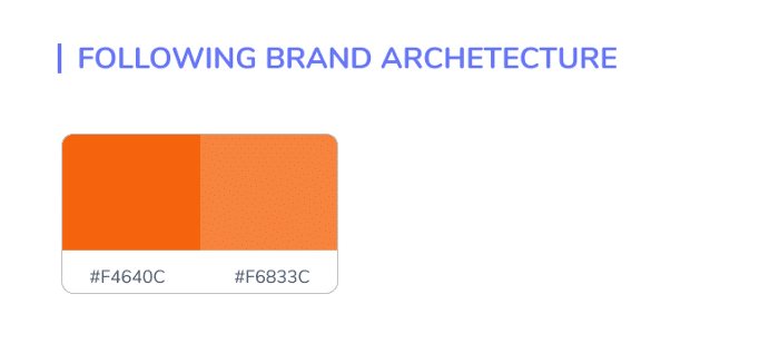
To maintain Brand architecture from parent product Cynoteck Technology the primary color orange is considered to maintain the hierarchy of brands within a single company.
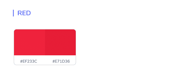
Red will be mainly used for backgrounds in messages and in error states to draw attention to important information or actions that are destructive or block workflow. You’ll find red used in components such as flag messages, buttons, illustrations, and typography.
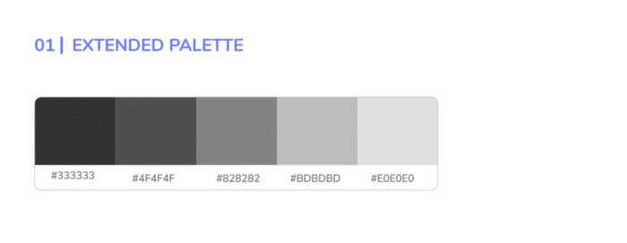
The extended palette consists of all the useable tints and shades of each color in the palette. Usage of these colors varies depending on the touchpoint, but they come in handy for illustrations and components in the product.
Neutrals
Neutrals have varying degrees of saturation that allow for the appropriate level of warmth across marketing and product. Typically they are used for text and subtle backgrounds when we don’t want to draw too much attention to a particular touchpoint or convey information such as “to do” or “disabled”
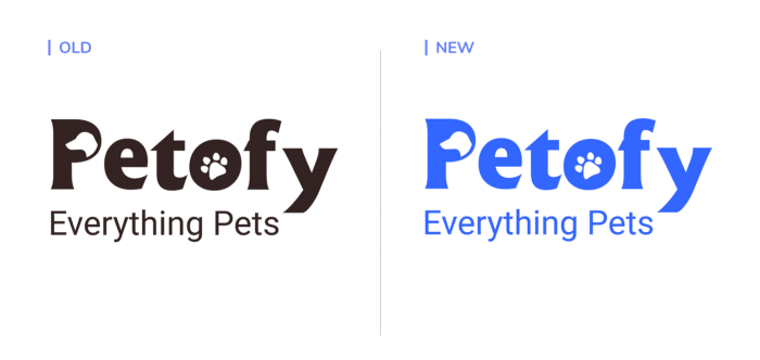
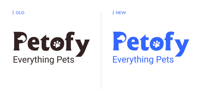
Logo
Probably there was no real need for a redesign at this point and it visually fits in the present situation, only the color was in need to be disturbed since it was not good from a hierarchy standpoint and the stakeholders wanted us to concentrate more on the color and typography.
Choosing type
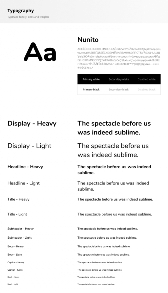
Text is one of the primary ways which as a designer we can communicate with our users. It can enhance and can even destroy the conversation rate along with destroying or enhancing design. Keeping in mind how to set the mood, tone, and style in design, we wanted to use soft
fonts which is a well-balanced, highly-readable sans-serif typeface and the characters should have thin, uniform stroke widths that work well for both body and display copy.
The type Nunito was chosen since it is a well balanced sans serif typeface that specks in a similar tone to our brand voice.
Conclusion
Branding helped us understand it’s far more important for colors to support the personality you want to portray instead of trying to align with stereotypical color associations.
Although different colors can be perceived in different ways, the descriptive names of those colors matter as well even emotions and color physiology should also be taken into consideration very carefully.
Last and the most important that matters is storytelling like how do you present your work to others and show values that each color and other elements can provide to the product in terms of user experience business marketing etc.
Wohoooo🎉congrats! you made it to the end 🔥
Thanks for reading it till the end, tell me in the comments if you liked it 💖 , and don’t forget to hit that clap button👏
If you enjoyed this post, we would be very grateful if you’d help it spread by emailing it to a friend, or sharing it on Twitter or Facebook also please comment if you have any feedback.
Petofy is an aggregator platform for everything your pet needs. It connects pet owners with pet service providers helping them find all services in one digital platform.
Why rebranding
Want to reposition and communicate our core values crystal clear like who we are and what values do we provide.
About
This blog is the overview of our disciplined process that we have followed before reaching the final solution and our learnings throughout the journey.
Understanding brand
To understand the brand better we’ve requested the Baseline information from stakeholders by asking some core questions mentioned below:
What does your business do?
What is your mission?
Who is the target customer?
What is the brand’s personality?
What are your Brand Attributes?
What words would you use to describe your brand?
Who are the top three competitors?
Answers to these questions have helped us understand their brand better.
Competitive Audit
To understand the competition’s brands, their key messages, and identity in the marketplace were analyzed to understand their conversation rate and how we can be different from them in terms of visual identity (Symbols, Forms, Color, Typography).
Finding the right attributes
Attributes were segregated and major ones were highlighted from the questions that were asked before.
Attributes VS Visuals
To understand the visual grammar of each highlighted attribute, visuals were collected to understand the majority of colors used in each image and to understand what emotional values are they conveying.
Moodboard
Since there were too many visuals at the same time previously, so the final 5–6 visuals were selected to use in the mood board to understand the kind of emotions and message one will get in the first 5-seconds view.
Thoughts behind each visual
Feedbacks on mood board
Moodboard were circulated among veterinarians, pet parents, Teenagers and were asked to comment on some of the keywords that come to their mind when they first see this so that we can validate my thought process and understand how effective each visual can be by color or the content that it has.
Understanding primary color
Based on previous answers and research the color blue and green were taking a call towards the brand’s primary color. But to create a hierarchy on site that “coaches” customers on which color encourages action we tried to study the color psychological properties of the color green and blue.
Personality Mapping
We have not deep dive into this step but did a basic overview based on comparing basic terms like professional vs casual and more with different colors. To understand which color can create more value in terms of actions and emotions.
Color Strategy
Since the color blue was standing out more in all the past steps that we have taken, so we tried to validate our design decision by answering the following questions mentioned below.
The primary palette is comprised of neutrals, white, and blue was considered to build trust and increase the conversation rate with the product.
Blue is considered for primary actions, buttons, text links, for indicating progress and representing authentication. A neutral white will be used primarily for body text and headings, and pure white (#FFfFF) WILL BE used for page backgrounds.
The secondary palette is made up of red, yellow, orange, green, etc to provide consistency and to use in illustrations to convey brand values. Each color is selected intentionally with properly balanced contrast values to provide meaningful conversation within our product.
To maintain Brand architecture from parent product Cynoteck Technology the primary color orange is considered to maintain the hierarchy of brands within a single company.
Red will be mainly used for backgrounds in messages and in error states to draw attention to important information or actions that are destructive or block workflow. You’ll find red used in components such as flag messages, buttons, illustrations, and typography.
The extended palette consists of all the useable tints and shades of each color in the palette. Usage of these colors varies depending on the touchpoint, but they come in handy for illustrations and components in the product.
Neutrals
Neutrals have varying degrees of saturation that allow for the appropriate level of warmth across marketing and product. Typically they are used for text and subtle backgrounds when we don’t want to draw too much attention to a particular touchpoint or convey information such as “to do” or “disabled”
Logo
Probably there was no real need for a redesign at this point and it visually fits in the present situation, only the color was in need to be disturbed since it was not good from a hierarchy standpoint and the stakeholders wanted us to concentrate more on the color and typography.
Choosing type
Text is one of the primary ways which as a designer we can communicate with our users. It can enhance and can even destroy the conversation rate along with destroying or enhancing design. Keeping in mind how to set the mood, tone, and style in design, we wanted to use soft
fonts which is a well-balanced, highly-readable sans-serif typeface and the characters should have thin, uniform stroke widths that work well for both body and display copy.
The type Nunito was chosen since it is a well balanced sans serif typeface that specks in a similar tone to our brand voice.
Conclusion
Branding helped us understand it’s far more important for colors to support the personality you want to portray instead of trying to align with stereotypical color associations.
Although different colors can be perceived in different ways, the descriptive names of those colors matter as well even emotions and color physiology should also be taken into consideration very carefully.
Last and the most important that matters is storytelling like how do you present your work to others and show values that each color and other elements can provide to the product in terms of user experience business marketing etc.
Wohoooo🎉congrats! you made it to the end 🔥
Thanks for reading it till the end, tell me in the comments if you liked it 💖 , and don’t forget to hit that clap button👏
If you enjoyed this post, we would be very grateful if you’d help it spread by emailing it to a friend, or sharing it on Twitter or Facebook also please comment if you have any feedback.