Nitin Dangwal, a Senior Team Lead at Cynoteck, is an experienced Salesforce professional with a remarkable 15+ year tenure in the IT industry. Starting as a Cobol developer, he transitioned to Salesforce, recognizing its vast potential in the realm of cloud computing. Nitin's extensive 15+ years of experience in Salesforce CRM have been pivotal in Read More
We are Microsoft Gold partner with its presence across the United States and India. We are a dynamic and professional IT services provider that serves enterprises and startups, helping them meet the challenges of the global economy. We offer services in the area of CRM Consultation and implementation, Application development, Mobile application development, Web development & Offshore Development.
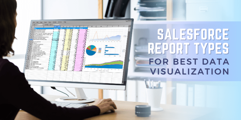
Salesforce Report Types for Best Data Visualization
Nothing compares to Salesforce for creating lasting relationships with your clients. And the best aspect is that Salesforce reporting collects information about your customers, their problems, and their requirements and expectations as you develop relationships with them. One of the main attractions of Salesforce applications is the report builder and the different Salesforce report types. By definition, a report is a collection of records that are displayed in list form and are retrieved using specific criteria.
Reports are used in Salesforce to display data in a tabular style so that users can filter, group, and sort the data, as necessary. Users can create custom reports by selecting fields from Salesforce objects (such as accounts, contacts, and leads) and applying filters to restrict the data displayed in the report.
How Salesforce Reports are essential for Best Data Visualization?
Salesforce reports are one of the most effective tools you have at your disposal for understanding your business data. You can simply uncover the causes of complicated trends, obtain useful information, and improve decision-making with well-generated reports.
Moreover, they serve as a crucial component of any administrator's job, and you must first choose the right report type to ensure you can access the right data.
Different report types in Salesforce are often based on a single object, two related objects (such as Accounts and Contacts), or feature "with" relationships (such as Opportunities and Activities).
Depending on the permissions granted, all users inside an org can access Salesforce Reports. These reports can be used for data analysis and KPI tracking for a variety of teams and departments, including sales, marketing, and customer service.
And department is the first option to choose when generating a report in Salesforce report types. As it serves as the report's foundation and determines the information that will be required to produce the report.
However, this article goes over how to create reports in Salesforce, Salesforce custom report types, and why they are helpful.
A Salesforce report is defined as a list of data produced using filtering criteria. Users can predict trends with the help of Salesforce Reports besides getting a competitive advantage. They can also share insights with other teams within your business by using Salesforce reports.
Salesforce reports furthermore improve your collaboration with other teams that generate income, for example, by analyzing the whole lead journey from MQL through conversion. A Salesforce admin can easily create and schedule these reports.
There are different Salesforce report types available that are ready to use right out of the box and that too without further configuration, and users can also make their report types. By creating custom reports, you can gain even more insights into your Salesforce data. Later, we will go into more detail about creating custom report types.
Salesforce CRM provides users with a variety of Salesforce report types to help with data analysis. 'Objects' in the system serve as the foundation for Salesforce reports. A table with columns and rows is how an object works.
An "Accounts" object, for example, might have columns for name, address, and contact information, and each row might include details about a specific account.
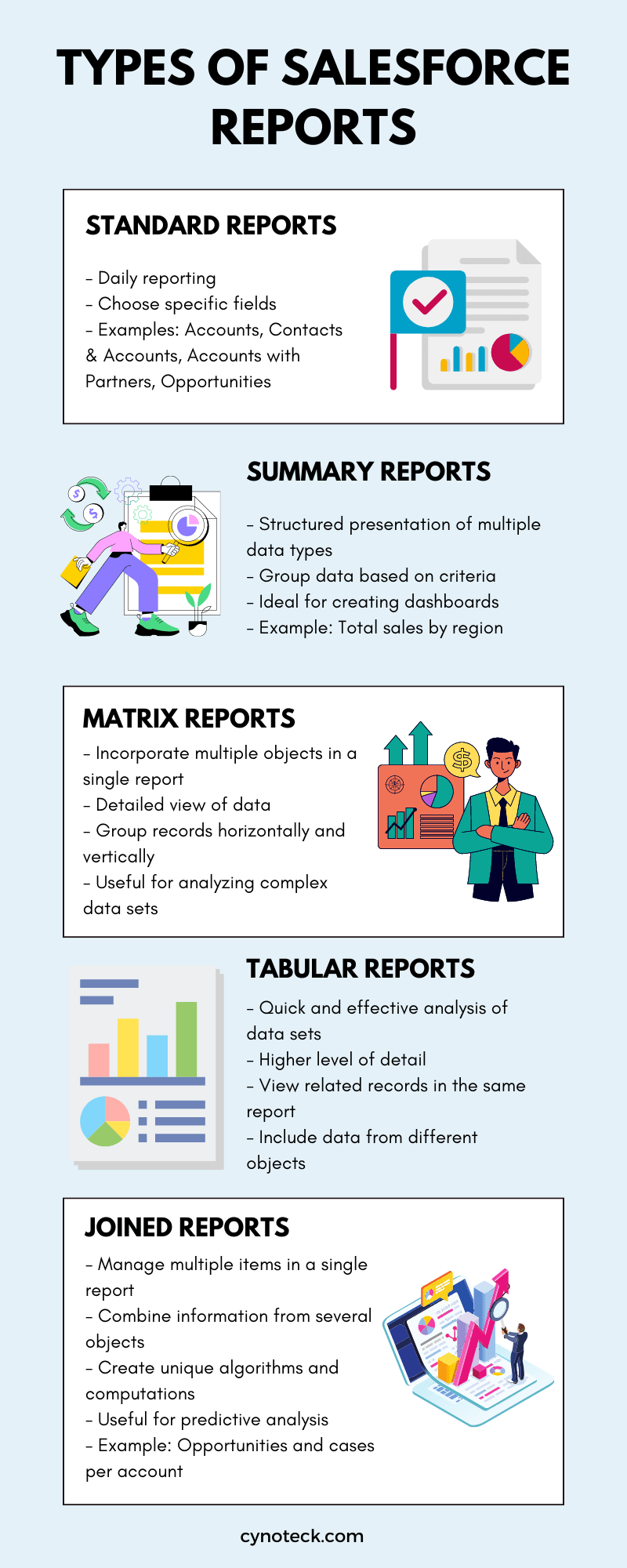
Depending on the goal of the report, each report type in Salesforce is perfect for presenting different data sets. The following list includes some of the most popular Salesforce report types:
[embedimage]
1) Standard reports
Your application will have easy access to standard report types. Standard report types can be used to complete most of your daily reporting. Standard reports allow you to choose which fields to include and incorporate columns from a single item.
Accounts, Contacts & Accounts, Accounts with Partners, Opportunities, etc. are a few examples of standard report types.
2) Summary reports
Summary reports are an excellent method to show multiple types of data in a structured way. You can group data using these summary reports based on specific criteria. They provide clients with more options for organizing information and are ideal for making stunning dashboards.
For example, you could develop a summary report that combines the data by region and displays the total sales for each one if you wanted to look at the total sales for each region.
3) Matrix reports
A matrix report is the best option if you require greater reporting options. You can incorporate numerous objects in a single report using these types of reports. This allows you to group records both horizontally and vertically, giving you the most detailed view of your data.
This type of report is helpful when it comes to analyzing complex data sets. Although it does take longer than other report types, the amount of insight you can get from a matrix report is unmatched.
4) Tabular reports
The ability to analyze data using tabular reports is valuable. Tabular reports offer a simple and effective solution to get insightful knowledge quickly and effectively about data sets. The level of detail in this analysis is higher.
You can view related records in the same report, and it incorporates data from different objects. These are excellent for providing you with the information for understanding a complete picture.
5) Joined reports
Salesforce Joined Reports offer a special technique to manage several items in a single report and are highly beneficial. These are regarded as the most complicated report types.
You can combine information from several objects in a connected report and even make your unique algorithms and computations, which is extremely helpful for predicting.
For example, you could use it to display in a single view the number of opportunities and cases per account.
Salesforce provides a wide range of reporting features that enable users to get insightful information and make intelligent business decisions.
The following are some essential Salesforce report features:
1) Report Builder
Users can easily build reports using Salesforce's drag-and-drop report builder interface without having any technical expertise.
Simply pick a Salesforce report type, format, and relevant fields, and the tool will create the report for you.
The builder can be launched with just one click by choosing the 'New Report' button.
2) Filters
Users can use report filters to limit the data that is included in a report based on parameters like date ranges, record kinds, or field values.
You should use filters when reading reports to ensure faster data returns. It controls the type of information you see.
Moreover, when viewing a report, adding, editing, or removing any filters becomes simple.
3) Fields
Users can add custom fields to Salesforce objects, which can then be used in reports to display additional data.
If you are looking at one report with a table of contents, every row represents the outcome, and the column represents the field.
Whenever you are creating or editing a report, make sure to include the appropriate fields. This will optimize the speed of running reports, as you are only including necessary details.
4) Report Types
Your report's total number of fields depends on the report type you choose. It describes the possible report items and fields.
Furthermore, users can define the fields and relationships to include in custom report kinds.
Reports on content, for example, would include fields like ID, name, and downloads, while reports on accounts will include fields like Account ID, Account name, and Phone.
5) Report Format
Users of Salesforce can pick from a variety of report formats to display their data. The report format you choose in Salesforce will impact how the results are displayed.
There are four alternatives available: Tabular, Summary, Matrix, and Joined; the last option is not accessible via Lightning Experience.
Creating reports to gain useful business insights from your data is easy to start with. Depending on the fields and records you wish to highlight while creating the report, you can choose the Salesforce report type, which is the very first part.
Reports appear on records when they meet the requirements specified in the report type. During the business data, this might help in developing an analytical process for fields and records.
Check out the steps below to learn how to create Salesforce reports:
Go to the Reports tab after logging into your Salesforce account. If you cannot see the tab, click the addition sign (+), and choose Reports from the drop-down menu.
In the top-right corner of the screen, click the New Report button.
Choose a report type that is appropriate for the data you wish to analyze. Standard report types are available, or you can design your unique report type. Before choosing Continue, you can use keywords to find the report you are looking for.
Set the parameters for the report, such as the fields and filters you want to use. At this point, you can also choose the report format.
Check the report's preview to make sure the information you want to see is there. In this section, you can choose exactly which fields your report should display. Simply click on Add Filter if, for example, you only want to see deals that you have won.
Choose the folder where you want to save the report and save it with a descriptive name. The report can also be shared with different users or groups.
Add components to the report, such as graphs, charts, or additional filters, this is optional.
Run the report to see the most recent data and statistics.
Schedule up the report to run automatically, then routinely email it to users or groups.
Additionally, you can change any settings, as necessary.
You can generate a Salesforce report by following these above-defined instructions to analyze your data and acquire important insights into how your business is running.
Since Salesforce custom report types are made from scratch, it helps you to create your report framework by combining different fields and objects. These reports are immensely powerful, but they also need a little more technical knowledge.
For example, the management can request a report that details the hours or days that each step of the approval process took to complete. This is not possible with the standard report types, as standard reports do not support this type of requirement.
A custom report format is further useful in obtaining an extensive view of your organization's data, which can also be utilized to monitor development and performance over time. They are particularly handy for reporting on multiple objects at once and for complicated forecasting situations.
How to Create a Salesforce Custom Report Type?
Follow these steps to create a Salesforce Custom Report Type:
In the Setup menu, look for and select "Object Manager."
Choose the object for which you wish to design a custom report type.
Choose "New Custom Report Type" from the "Report Types" section on the object's detail page.
Type a name and a description for the custom report.
Choose the primary object for the chosen report type. This will serve as the report's foundational element.
To include in the report type, pick any relevant objects. You are then able to display data from related items in the report.
Decide which fields to include in the report type. Additionally, you can choose from the object's custom fields that you have created.
If you want to add any filtering, sorting, or grouping in the report type, you can now set those settings here.
Check the report type's preview to make sure the desired data is displayed.
Now, you need to save the custom report type and assign it to a folder.
Share the customized report with other users or groups.
These steps will help you develop a custom report type in Salesforce that you can use to analyze your data according to your business's requirements.
Salesforce Reports form an integral part of every business strategy and different report types in Salesforce can help further. Insights gained from them are crucial for anticipating and creating a better business strategy. Hence, learning to create interactive and insightful reports is especially important.
Now that you are familiar with the different Salesforce report formats, it is time to act and create your next Salesforce report. Start analyzing your sales data, constructing reports, and designing a custom report type.
Customer service, logistics, supply chain management, and more areas are now being revolutionized by Salesforce. Maintain an edge over the competition by thoroughly understanding how to use Salesforce's features. Our Salesforce CRM solutions will be extremely beneficial to your business, contact us today.
Frequently Asked Questions about creating reports in Salesforce
1) What are reports in Salesforce?
Salesforce reports are effective tools that enable users to analyze and see their data. Users can use them to get insightful information, monitor performance, and promote informed decision-making by summarizing, filtering, and organizing data.
2) How many different types of reports does Salesforce offer?
Tabular, summary, matrix, and joined reports are the four basic types of reports you can make in Salesforce. Depending on the user's demands and requirements for analysis, these formats offer different data presentation methods.
3) What differentiates Salesforce reports from dashboards?
In Salesforce, there are two different ways to display data: reports and dashboards. Reports display the raw data, whereas dashboards provide a graphical summary of the data so you can quickly examine it for insights. Both are valuable resources to have in your toolbox because they let you view and examine several data sets simultaneously.
4) How can we share, schedule, and subscribe to a report in Salesforce?
For sharing, you need to click share after choosing the report you want to share. The next step is to enter the email addresses of the recipients you wish to send the report to and to choose their degree of access (view only, modify, etc.). You can provide a deadline by which the shared link will stop working. Next, if you need to schedule the report then click the schedule option after selecting the report you want to schedule. After that, you can choose the frequency (daily, weekly, monthly, etc.) and input the email address where the report should be sent. Now for the last one i.e., subscribe, click Subscribe after entering the report you wish to subscribe to. The next step is to enter your email address and choose how frequently (daily, weekly, monthly, etc.) you want to get the report.
Nothing compares to Salesforce for creating lasting relationships with your clients. And the best aspect is that Salesforce reporting collects information about your customers, their problems, and their requirements and expectations as you develop relationships with them. One of the main attractions of Salesforce applications is the report builder and the different Salesforce report types. By definition, a report is a collection of records that are displayed in list form and are retrieved using specific criteria.
Reports are used in Salesforce to display data in a tabular style so that users can filter, group, and sort the data, as necessary. Users can create custom reports by selecting fields from Salesforce objects (such as accounts, contacts, and leads) and applying filters to restrict the data displayed in the report.
How Salesforce Reports are essential for Best Data Visualization?
Salesforce reports are one of the most effective tools you have at your disposal for understanding your business data. You can simply uncover the causes of complicated trends, obtain useful information, and improve decision-making with well-generated reports.
Moreover, they serve as a crucial component of any administrator’s job, and you must first choose the right report type to ensure you can access the right data.
Different report types in Salesforce are often based on a single object, two related objects (such as Accounts and Contacts), or feature “with” relationships (such as Opportunities and Activities).
Depending on the permissions granted, all users inside an org can access Salesforce Reports. These reports can be used for data analysis and KPI tracking for a variety of teams and departments, including sales, marketing, and customer service.
And department is the first option to choose when generating a report in Salesforce report types. As it serves as the report’s foundation and determines the information that will be required to produce the report.
However, this article goes over how to create reports in Salesforce, Salesforce custom report types, and why they are helpful.
A Salesforce report is defined as a list of data produced using filtering criteria. Users can predict trends with the help of Salesforce Reports besides getting a competitive advantage. They can also share insights with other teams within your business by using Salesforce reports.
Salesforce reports furthermore improve your collaboration with other teams that generate income, for example, by analyzing the whole lead journey from MQL through conversion. A Salesforce admin can easily create and schedule these reports.
There are different Salesforce report types available that are ready to use right out of the box and that too without further configuration, and users can also make their report types. By creating custom reports, you can gain even more insights into your Salesforce data. Later, we will go into more detail about creating custom report types.
Salesforce CRM provides users with a variety of Salesforce report types to help with data analysis. ‘Objects‘ in the system serve as the foundation for Salesforce reports. A table with columns and rows is how an object works.
An “Accounts” object, for example, might have columns for name, address, and contact information, and each row might include details about a specific account.
Depending on the goal of the report, each report type in Salesforce is perfect for presenting different data sets. The following list includes some of the most popular Salesforce report types:
Copy Infographic
×
1) Standard reports
Your application will have easy access to standard report types. Standard report types can be used to complete most of your daily reporting. Standard reports allow you to choose which fields to include and incorporate columns from a single item.
Accounts, Contacts & Accounts, Accounts with Partners, Opportunities, etc. are a few examples of standard report types.
2) Summary reports
Summary reports are an excellent method to show multiple types of data in a structured way. You can group data using these summary reports based on specific criteria. They provide clients with more options for organizing information and are ideal for making stunning dashboards.
For example, you could develop a summary report that combines the data by region and displays the total sales for each one if you wanted to look at the total sales for each region.
3) Matrix reports
A matrix report is the best option if you require greater reporting options. You can incorporate numerous objects in a single report using these types of reports. This allows you to group records both horizontally and vertically, giving you the most detailed view of your data.
This type of report is helpful when it comes to analyzing complex data sets. Although it does take longer than other report types, the amount of insight you can get from a matrix report is unmatched.
4) Tabular reports
The ability to analyze data using tabular reports is valuable. Tabular reports offer a simple and effective solution to get insightful knowledge quickly and effectively about data sets. The level of detail in this analysis is higher.
You can view related records in the same report, and it incorporates data from different objects. These are excellent for providing you with the information for understanding a complete picture.
5) Joined reports
Salesforce Joined Reports offer a special technique to manage several items in a single report and are highly beneficial. These are regarded as the most complicated report types.
You can combine information from several objects in a connected report and even make your unique algorithms and computations, which is extremely helpful for predicting.
For example, you could use it to display in a single view the number of opportunities and cases per account.
Salesforce provides a wide range of reporting features that enable users to get insightful information and make intelligent business decisions.
The following are some essential Salesforce report features:
1) Report Builder
Users can easily build reports using Salesforce’s drag-and-drop report builder interface without having any technical expertise.
Simply pick a Salesforce report type, format, and relevant fields, and the tool will create the report for you.
The builder can be launched with just one click by choosing the ‘New Report‘ button.
2) Filters
Users can use report filters to limit the data that is included in a report based on parameters like date ranges, record kinds, or field values.
You should use filters when reading reports to ensure faster data returns. It controls the type of information you see.
Moreover, when viewing a report, adding, editing, or removing any filters becomes simple.
3) Fields
Users can add custom fields to Salesforce objects, which can then be used in reports to display additional data.
If you are looking at one report with a table of contents, every row represents the outcome, and the column represents the field.
Whenever you are creating or editing a report, make sure to include the appropriate fields. This will optimize the speed of running reports, as you are only including necessary details.
4) Report Types
Your report’s total number of fields depends on the report type you choose. It describes the possible report items and fields.
Furthermore, users can define the fields and relationships to include in custom report kinds.
Reports on content, for example, would include fields like ID, name, and downloads, while reports on accounts will include fields like Account ID, Account name, and Phone.
5) Report Format
Users of Salesforce can pick from a variety of report formats to display their data. The report format you choose in Salesforce will impact how the results are displayed.
There are four alternatives available: Tabular, Summary, Matrix, and Joined; the last option is not accessible via Lightning Experience.
Creating reports to gain useful business insights from your data is easy to start with. Depending on the fields and records you wish to highlight while creating the report, you can choose the Salesforce report type, which is the very first part.
Reports appear on records when they meet the requirements specified in the report type. During the business data, this might help in developing an analytical process for fields and records.
Check out the steps below to learn how to create Salesforce reports:
Go to the Reports tab after logging into your Salesforce account. If you cannot see the tab, click the addition sign (+), and choose Reports from the drop-down menu.
In the top-right corner of the screen, click the New Report button.
Choose a report type that is appropriate for the data you wish to analyze. Standard report types are available, or you can design your unique report type. Before choosing Continue, you can use keywords to find the report you are looking for.
Set the parameters for the report, such as the fields and filters you want to use. At this point, you can also choose the report format.
Check the report’s preview to make sure the information you want to see is there. In this section, you can choose exactly which fields your report should display. Simply click on Add Filter if, for example, you only want to see deals that you have won.
Choose the folder where you want to save the report and save it with a descriptive name. The report can also be shared with different users or groups.
Add components to the report, such as graphs, charts, or additional filters, this is optional.
Run the report to see the most recent data and statistics.
Schedule up the report to run automatically, then routinely email it to users or groups.
Additionally, you can change any settings, as necessary.
You can generate a Salesforce report by following these above-defined instructions to analyze your data and acquire important insights into how your business is running.
Since Salesforce custom report types are made from scratch, it helps you to create your report framework by combining different fields and objects. These reports are immensely powerful, but they also need a little more technical knowledge.
For example, the management can request a report that details the hours or days that each step of the approval process took to complete. This is not possible with the standard report types, as standard reports do not support this type of requirement.
A custom report format is further useful in obtaining an extensive view of your organization’s data, which can also be utilized to monitor development and performance over time. They are particularly handy for reporting on multiple objects at once and for complicated forecasting situations.
How to Create a Salesforce Custom Report Type?
Follow these steps to create a Salesforce Custom Report Type:
In the Setup menu, look for and select “Object Manager.”
Choose the object for which you wish to design a custom report type.
Choose “New Custom Report Type” from the “Report Types” section on the object’s detail page.
Type a name and a description for the custom report.
Choose the primary object for the chosen report type. This will serve as the report’s foundational element.
To include in the report type, pick any relevant objects. You are then able to display data from related items in the report.
Decide which fields to include in the report type. Additionally, you can choose from the object’s custom fields that you have created.
If you want to add any filtering, sorting, or grouping in the report type, you can now set those settings here.
Check the report type’s preview to make sure the desired data is displayed.
Now, you need to save the custom report type and assign it to a folder.
Share the customized report with other users or groups.
These steps will help you develop a custom report type in Salesforce that you can use to analyze your data according to your business’s requirements.
Salesforce Reports form an integral part of every business strategy and different report types in Salesforce can help further. Insights gained from them are crucial for anticipating and creating a better business strategy. Hence, learning to create interactive and insightful reports is especially important.
Now that you are familiar with the different Salesforce report formats, it is time to act and create your next Salesforce report. Start analyzing your sales data, constructing reports, and designing a custom report type.
Customer service, logistics, supply chain management, and more areas are now being revolutionized by Salesforce. Maintain an edge over the competition by thoroughly understanding how to use Salesforce’s features. Our Salesforce CRM solutions will be extremely beneficial to your business, contact us today.
Frequently Asked Questions about creating reports in Salesforce
1) What are reports in Salesforce?
Salesforce reports are effective tools that enable users to analyze and see their data. Users can use them to get insightful information, monitor performance, and promote informed decision-making by summarizing, filtering, and organizing data.
2) How many different types of reports does Salesforce offer?
Tabular, summary, matrix, and joined reports are the four basic types of reports you can make in Salesforce. Depending on the user’s demands and requirements for analysis, these formats offer different data presentation methods.
3) What differentiates Salesforce reports from dashboards?
In Salesforce, there are two different ways to display data: reports and dashboards. Reports display the raw data, whereas dashboards provide a graphical summary of the data so you can quickly examine it for insights. Both are valuable resources to have in your toolbox because they let you view and examine several data sets simultaneously.
4) How can we share, schedule, and subscribe to a report in Salesforce?
For sharing, you need to click share after choosing the report you want to share. The next step is to enter the email addresses of the recipients you wish to send the report to and to choose their degree of access (view only, modify, etc.). You can provide a deadline by which the shared link will stop working. Next, if you need to schedule the report then click the schedule option after selecting the report you want to schedule. After that, you can choose the frequency (daily, weekly, monthly, etc.) and input the email address where the report should be sent. Now for the last one i.e., subscribe, click Subscribe after entering the report you wish to subscribe to. The next step is to enter your email address and choose how frequently (daily, weekly, monthly, etc.) you want to get the report.
If you are new to automation and confused about Workflow or Process Builder. Need not to worry, we have got you all covered. Talk to our experts and clear all the cloudy thoughts about automation.